Terms and ConditionsPrivacy Policy Consumer Rights
©Copyright 2025 by lens.me. All Rights Reserved.Your Guide To Matching 2019 Pantone Shades With Colored Contacts
Fashion lovers worldwide know that the Pantone colors of each year are a big deal. Whether you want to paint your bedroom with one of the popular shades or you feel the urge to overhaul your wardrobe, it’s a fair statement to say that people pay attention to the tones dubbed “colors of the year.”

If you’re embarking on the task of completely changing up your entire look to match 2019’s shades, you have a fun job ahead of you. Let’s take some time to explore the colors of the year and how you can choose colored contact lenses that highlight and contrast these tones.
2019’s Palette with Colored Contact Lenses
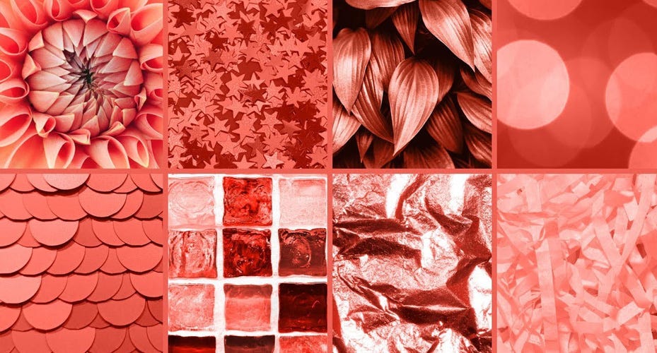
Each year, Pantone reveals a ton of colors that will be featured over the next 12 months. Between the basic shades and the neutral collection, there are more than a dozen tones to play with, but today we’re going to look at some of the bolder options out there. Here’s a quick rundown of what you will be seeing on store shelves:
- PANTONE 19-1862 Jester Red - An intriguing blend of red with the smallest touch of purple, this shade will look great on all complexions. Try a stunning lipstick in this color or a jacket for a pop of brightness.
- PANTONE 15-0960 Mango Mojito - This yellow and orange combination will have you thinking of sunny days in no time. Best on those with darker skin, Mango Mojito is a great accent color for your wardrobe.
- PANTONE 17-1564 Fiesta - Just as the name entails, this color brings the party to you! A red and orange combination that’s perfectly balanced, it almost mimics a hint of coral. Shirts or pants in this shade will be a welcome addition to your life.
- PANTONE 15-1264 Turmeric - A zesty orange can be a fun tone to wear for special occasions, and this one is just right. Not too yellow and not too drab, Turmeric will certainly be seen in home decor, clothing, and more.
Related: 2019 Fashion Update - How To Match Contacts With Tortoiseshell Pattern
Matching Your Colored Contact Lenses
Once any of these colors have found a way into your heart, you’ll no doubt be wearing them on a regular basis. However, some of your current contact lens colors may not match these shades very well. What can you do? Shop at lens.me of course! We have a wide range of lenses to choose from and have selected several that we think will perfectly complement Pantone’s releases:
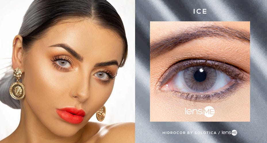
Hidrocor Ice by Solotica - one of the boldest colors in the Solotica Hidrocor collection , Hidrocor Ice is a bright baby blue to gray that will perfectly blend with any of the above Pantone colors. Pairing ocean colored eyes with reds, oranges, and yellows is a dream come true!
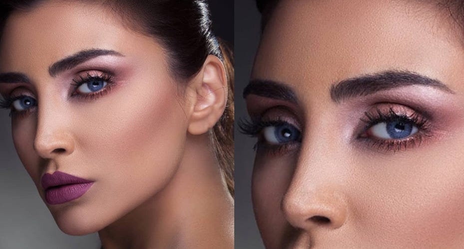
Addict Platino by Anesthesia - Anesthesia’s Addict collection , has done it again with a blue that looks incredibly natural. A hint of grey mellows out this look to pair well with any complexion. Try it with Jester Red lipstick for a special style.
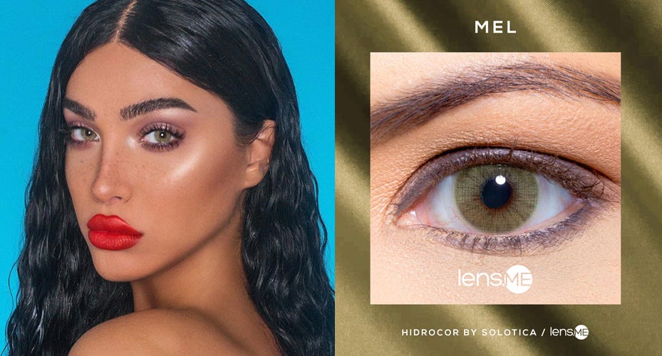
Hidrocor Mel by Solotica - this yearly lens pops a punch of color with a rich pistachio green that’s truly stunning. Any of the 2019 Pantone colors will be accented beautifully by this bold tone. Another of Solotica's top favorites , Mel looks great on those with naturally light eyes.


